 I realize that the idea of a logo is to create brand identity and brand recognition, and that is why it needs to be a constant element that doesn’t change much throughout time. However, since I am not a real brand but mostly just playing with the concept, I can do whatever I like, right?
Well, I am sure those followers who keep checking this space obsessively every day (right?) have noticed the change already: I have a new logo up on the blog! It’s been long in the making.
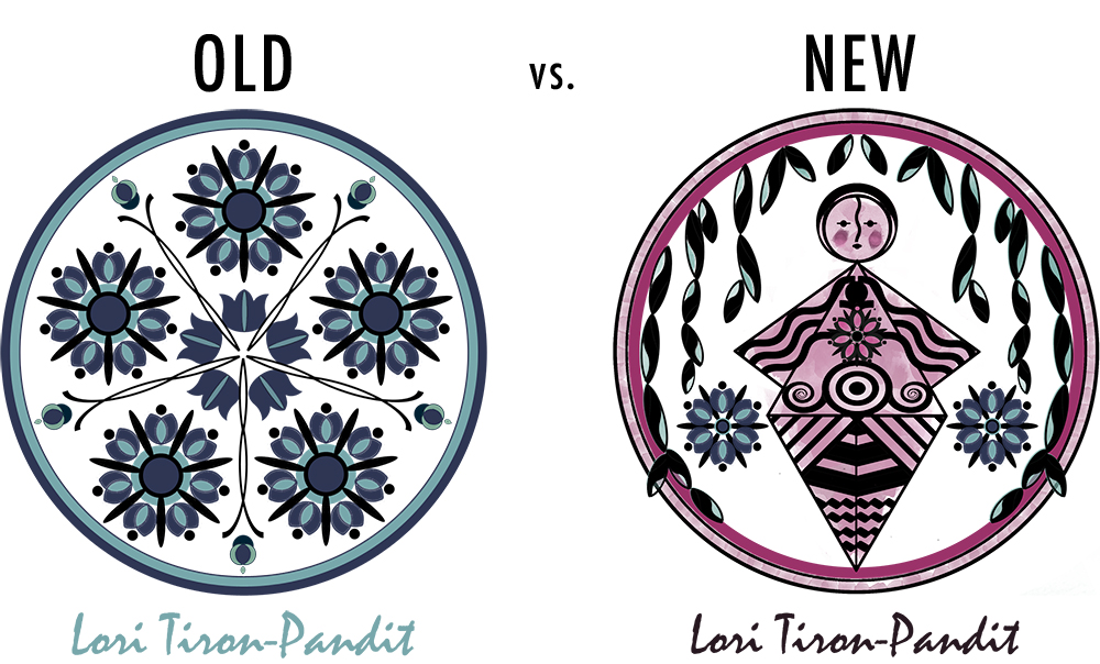
The blue flower has always been part of my “branding.” My original design looked something like this:
I always loved that blue flower for its symbolism: the pursuit of artistic perfection, as the romantics envisioned it. Later I came up with the more stylized circle logo that included the blue flower but added the symbolism of the pentagram and the number seven (petals) with all their mystical connotations. Even today I find it hard to leave behind that beautiful design. I think it’s strong and sharp in its symmetry and yet the shape of the flowers lend it a soft and delicate feel at the same time.
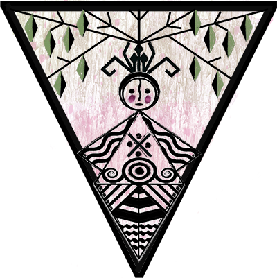
Now, the new logo is quite a departure. The blue flower is still there, but plays a minor role. The main element this time is the Cucuteni goddess figure (you might remember that I wrote about it here). I created the design a long time ago on paper, but never managed to work on the digital version until last week. I also changed the color scheme of the logo and the whole website to include pink (instead of teal), as yet another element that speaks to me as a feminist (I’ll write more about that in another post).
I’m not sure if I like this new logo better. I think the older design was stronger aesthetically, but the new one carries more symbolism that is very close to my heart. I wanted a more woman-centric logo. Women’s issues are so important to me and the current political debate surrounding the Democratic presidential candidates show me that these issues are still very much misunderstood (especially when I see what I perceive as possibly covert or suppressed sexism in the attacks against the woman who is running on a very solid platform, with immense authority and experience in the areas that matter to a president’s actual influence, and who’s only fault is that she has been forced to “lean in” to get where she got, and now because of that she’s seen as too “establishment”).
Anyway, I like the resulting logo well enough. I’ll give it a chance to grow on me. And in the meantime, I might refine it further a little bit. But for now, this is it. The change happened. Let’s embrace the feminine perspective, people.


Right? This is my playground! Thank you for agreeing, Rachel.
Love the new logo – such a beautiful image. I was very fond of the blue flower, and I followed the tiny adjustments and refinements you made to it, but there’s no reason you can’t change your logo as often as you choose – it is yours, after all!