 I thought I’d do something fun today and show you the evolution of my cover art and book titles throughout time. I have talked many times on this blog (a good blogger would now go back through the archives to actually link to said posts, but I, well, you know) about how I enjoy taking breaks from writing to work on cover design.
Creating a cover in Photoshop means using a different part of my brain, a different skill set, having a different level of emotional and mental involvement in the work. I am in a bit of a dark place right now with the book (and it’s not even metaphorical: I am trying to write in a disturbing scene) and I thought I would give myself a moment to breathe and enjoy playing with images instead of words. As a result, I came up with a new cover. It’s the one you see in the beginning of this post. I like it a lot. I think this is probably it. I did, however, use an image that I haven’t purchased yet, because it is possible that I might change my mind again (I have bought in the past images that I never ended up using) so I am waiting it out a little to see how I feel about it in a few months.
And here, for your entertainment, are my attempts at book covers as they happened in time, from ridiculous to horrible to almost passable.
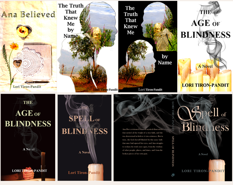
THE EVOLUTION OF THE SPELL OF BLINDNESS COVER (from the earliest to the last):
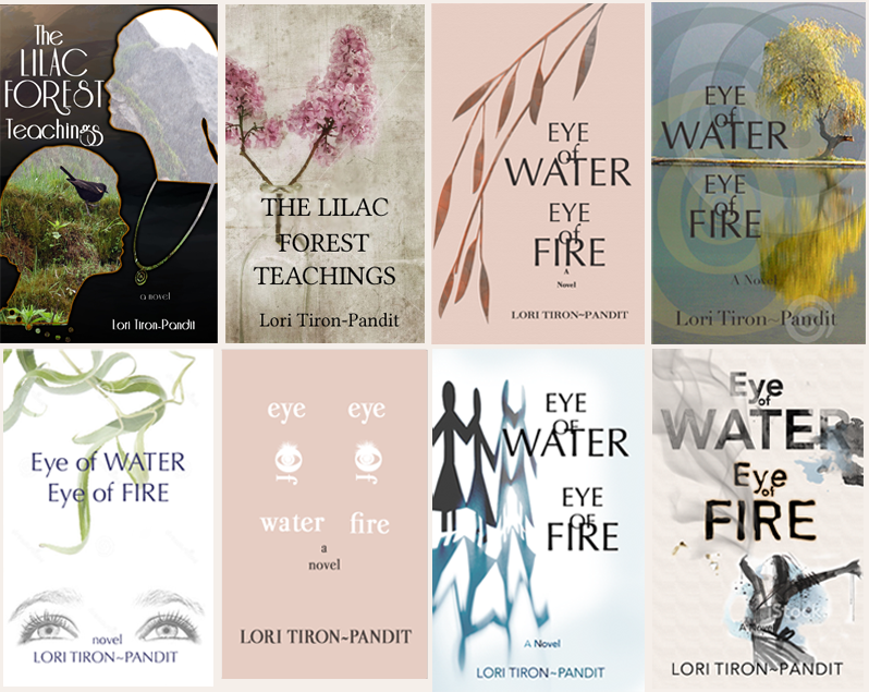
 THE EVOLUTION OF THE EYE OF WATER, EYE OF FIRE COVER (from the earliest to the latest):
 You can probably tell that my photoshop skills have improved, as have my confidence and my freedom with ideas. With the second book I tried more things, although I have always wanted a typography-based cover. It also looks like I really liked that head contour idea, because I tried a version of that for each book (I’m pretty proud that I drew that profile, I guess). The first cover for Spell uses a photo that I took too. But that was it. Afterwards I started using images taken by photographers better than I will ever be and/or drawn by actual artists. The titles also changed several times for both books. Only two show on the second book, but the first title, which never made it on a cover, was Mutiny of Violets. I still kind of like it.
Well, this was fun, wasn’t it? Now time to get back to the actual writing.


You’re an awesome cover designer – I covet them all – I’d love to see you design the covers for a series!
Thank you, Rachel, for sharing your “honest” opinion 😉